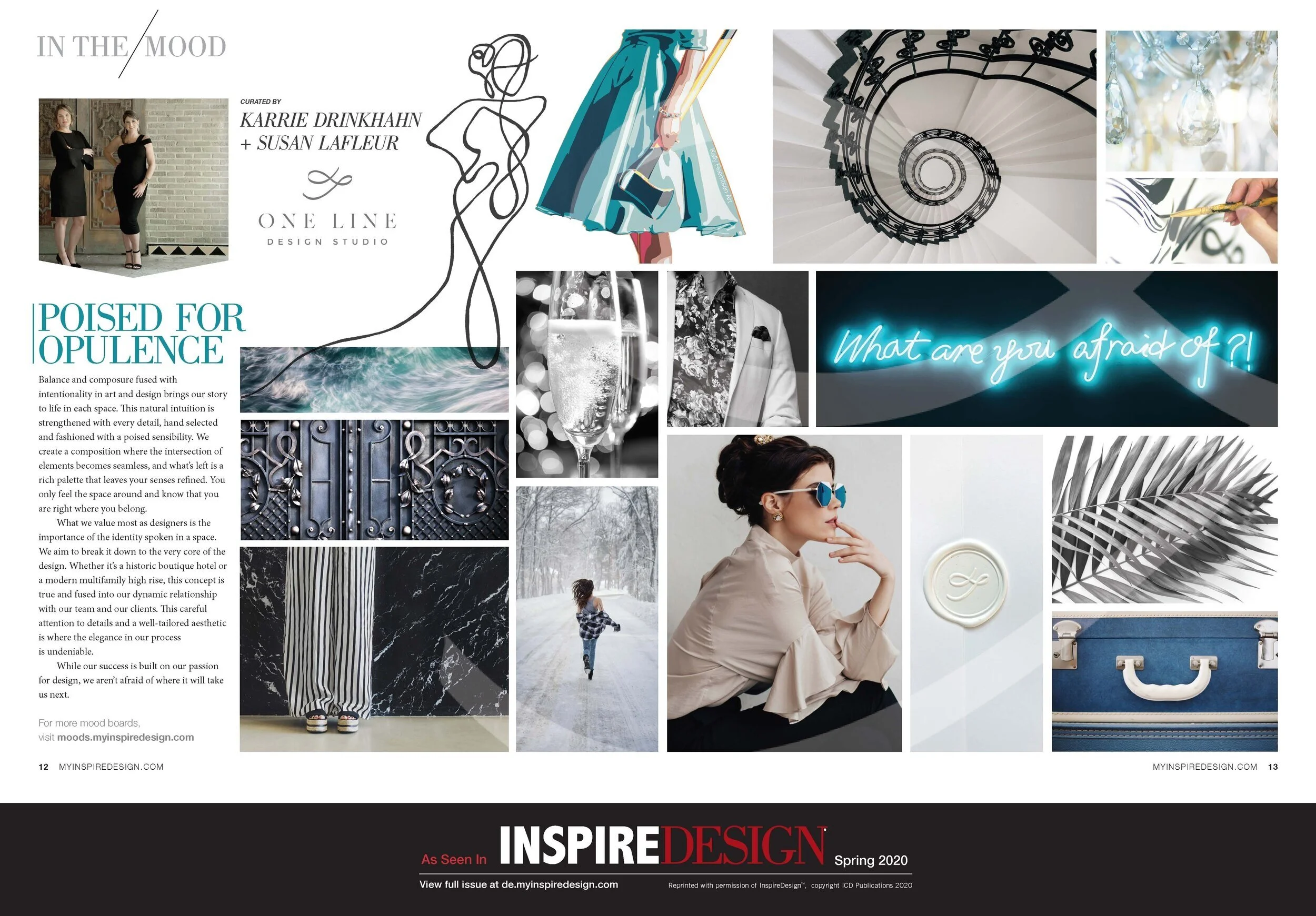
As seen in Inspire Design Magazine - Spring 2020
When asked by Inspire Design and Hotel Business Magazine’s Editor-in-Chief, Christina Trauthwein if we wanted to create a mood board for their Spring publication, we were more than in the mood. Now we want to share that process with you and dive into a few of the elements selected for this piece. Have you seen the full spread yet?! Check it out below or see it here on page 12-13 in the Spring 2020 edition.
The section of this magazine called “In the Mood,” showcases mood boards curated by a designer. The vision completely up to us and we were allowed to let our imagination run free. Developing a mood board for interior design spaces often starts as simply as this, especially when you are given very little information at the start. In this case, the opportunity presented itself to design for our ideal client, and fashion a board filled with elegance and timeless elements.

‘Striking’ artwork by Kelly Reemtsen - www.KellyReemtsen.com
Art that says more
The art that we selected and customized just for this board speaks to the overall concept. Kelly Reemsten’s art showcases elaborate depictions of the role of the modern-day woman. At first glance they are feminine, adorned in fashionable designer dresses and accessories, but they are more than that. The objects they hold from wrenches to chainsaws addresses the role of the contemporary woman with which anyone can identify. As two strong Women, running our own firm and poised for all that entails, this gives us our energy. Stay tuned, as we will be diving into detail with Kelly’s work in preparation for her online show at the end of the month!

Karissa and Brandon Quinno Photography, @Dualphotto
Finding unique photography
Having an eye to find and place imagery that is cohesive and individually meaningful is the challenge. One photograph in particular says so much all by itself and helps complete our concept. Photo by @DualPhotto, Karissa Quinno and Brandon Quinno is daring, explorative, and mysterious. An element that ties to our backgrounds, growing up in the snowy climate of Michigan and the youth that this image inspires to run free, no matter the circumstances along your path without looking back. This image speaks to our childhood and to our futures.
Subtle elements
Pay attention to the details, the placement of elements can make or break an image. We are considering balance in color and form, texture, pattern, and how each plays out on the page. Hidden elements like the wax mark of our branded logo are subtle but when you look closely it’s a pleasant surprise. There is another hidden logo mark in one of the paintings, can you find it?
The cropped in image of the blue suitcase is a nod to our love for travel & the hospitality design industry, but the selection of this image with its sophisticated buckles and sharp stitching is purposeful.
Poised for Opulence
Putting words to conceptual design is often the hardest part, sometimes it’s a feeling that’s evoked and once all the images were in place, it was then that the language started to evolve. “Poised for Opulence” marks the composure and intentionality in art and design that brings our story to life in each space. The concept for interior design also is fused into our dynamic relationship with our team and our clients. This careful attention to details and a well-tailored aesthetic is where the elegance in our process is undeniable.”
What are you afraid of?
So, What are you afraid of? And Why is all this important? These details and intentional design elements carry over to our interior design process. There isn’t a corner turned or mark made that didn’t take consideration. Pursuing elegant and sophisticated design takes a bold confidence and a lack of fear. “While our success is built on our passion for design, we aren’t afraid of where it will take us next.”